Weekend Talking Points - 'In the Dark'
Despite being “in the dark” when it comes to new data, the Fed cut short-term interest rates for the second time this year and also announced the official end of QT — Quantitative Tightening. Mortgage rates remain near multi-year lows but can’t seem to crack into the fives.
CPI (inflation) was a bit better than expected. In September, “headline” CPI climbed to +3.0% year-over-year (from +2.9% YoY), while “core” CPI eased to +3.0% YoY (from +3.1% YoY). Since most Wall Street economists forecast that “core” CPI would be flat +3.1% YoY, the actual result was a relief for the bond market.

TP: This report was delayed for several weeks due to the government shutdown. In fact, BLS statisticians were called back to work to compile the data because it was needed to calculate the COLA (Cost of Living Adjustment) for Social Security Payments.
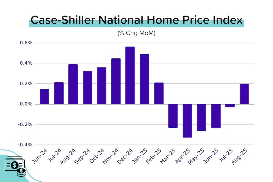
Case-Shiller: A recovery amidst a slowdown. Over the previous 5 months, Case-Shiller’s seasonally-adjusted (SA) national home price index had consistently declined month-over-month (for a total drop of 1.1%). In August, pricing momentum reversed course, with the national SA index rising 0.2% MoM. Despite that, the year-over-year price growth continued to decline, dropping from +1.6% YoY in July to +1.5% YoY in August. [More on this later]
FHFA: Sees even stronger growth. The national FHFA index (SA) rose 0.4% MoM in August, ending four consecutive months of declines. Annual price growth was flat at 2.3% YoY. The strongest price growth was seen in the Middle Atlantic (+6.3% YoY) and New England (+4.7%) regions; the weakest in the Pacific (-0.6% YoY) region.
Pending home sales flat, what’s up with that? I was expecting a much better result from NAR’s Pending Home Sales Index (PHSI). But the September index reading was flat MoM at 74.8 (down -0.9% YoY). This despite average mortgage rates falling approximately 75 basis points over the last 3 months. The silver lining is that the non-seasonally-adjusted (NSA or “raw”) data is up +1.5% YoY.
TP: So does this mean that not even lower rates will get people home-shopping again? I don’t think so. If rates stay this low for a few months (or go even lower), we will absolutely see a rebound in purchase activity.
The Fed cut rates for the 2nd time this year. The “data dependent” Fed is currently operating in the dark (except for the CPI report). Despite this, most Fed members voted to cut rates by 25 basis points (25 bps = 0.25% = one-quarter of a percentage point). Two voting members dissented. Trump appointee Stephen Miran wanted a larger, 50 bps cut. Jeffrey Schmid (KC Fed President) wanted no cut.

Bye Bye to QT. After the FOMC meeting, Fed Chairman Jerome Powell also announced an official end to the balance sheet run-off (the end of QT = quantitative tightening). QT involved the Fed selling securities (mostly treasury bonds) which put downward pressure on prices and upward pressure on yields. With QT over, that headwind for rates has stopped blowing.
On the Case (Shiller) for September 2025
Annual price growth for Case-Shiller’s seasonally-adjusted national index decelerated further to just +1.5% YoY in August 2025. (We started the year at +4.1% YoY!) This despite solid +0.2% MoM price growth, which ended five straight months of declines. Year-to-date, the SA national index is down 0.2%, which annualizes at -0.3%.
Remember: The Case-Shiller data comes with a big lag. This data is for August. That means that reversal in price momentum occurred BEFORE the big drop in mortgage rates from late August through to today.
As we do each month, we looked at the 20 big city indexes in detail. Here’s what we found:
- Only 9 of the 20 big city indexes saw their SA indexes decline MoM in July (down from 11 last month, and 15 the month before that). The largest drops were seen in Miami and Phoenix (both -0.6% MoM); and Portland, Las Vegas and Tampa (all -0.5% MoM).
- The biggest MoM increases came from San Francisco (+0.8% MoM!), Chicago (+0.6% MoM), and Seattle (+0.5% MoM). The highest annual growth came from New York City (+6.1% YoY) and Chicago (+5.9% YoY).
- 7 of the 20 big cities are currently seeing YoY price declines in their SA indexes (unchanged from last month): Tampa (-3.3% YoY), Phoenix (-1.7% YoY), Miami (-1.7% YoY), San Francisco (-1.5% YoY), Dallas (-1.2% YoY), San Diego (-0.7% YoY) and Denver (-0.7% YoY)
- Only four cities made new all-time highs in July: NYC, Chicago, Cleveland and Minneapolis. Detroit saw a MoM decline so dropped out.
Reminder: The Case-Shiller index is the gold standard for measuring home price growth because it uses the repeat sales method (looking at ‘pairs’ of transactions for the same home) to more accurately gauge true appreciation. However, this accuracy comes at a cost: a nearly two-month time lag.
West Coast Price Rebound?
The price reversal at the national level has been driven, in part, by a notable rebound in the price indexes of several west coast cities. San Francisco’s +0.8% MoM gain was very notable — that city’s index is still 8% below its mid-2022 peak.


Bond and Mortgage Market
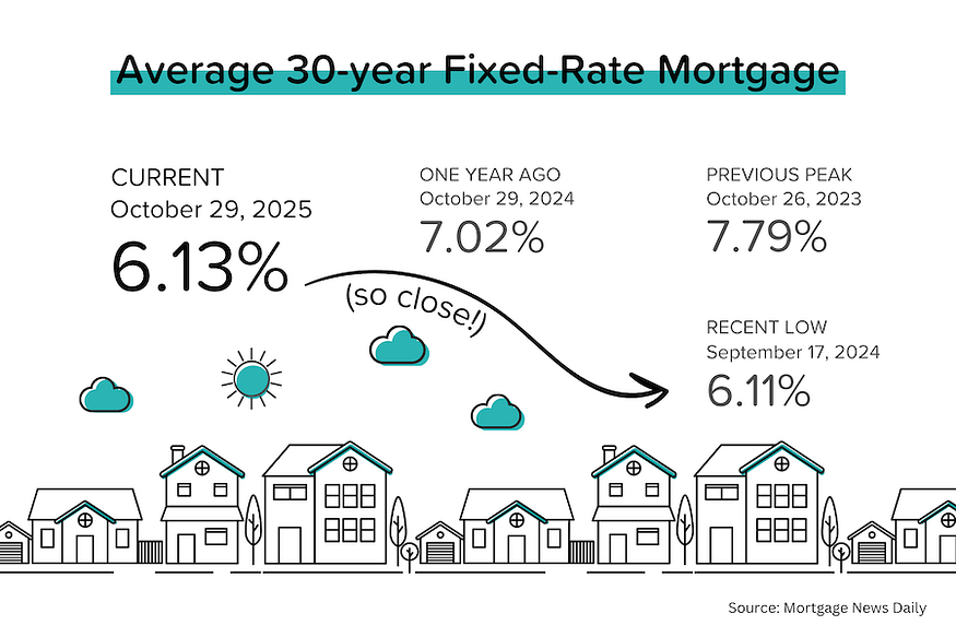
The yield on the 10-year US Treasury bond remained just below 4% while average mortgage rates (according to Mortgage News Daily) dropped to 6.13%. We are very, very close to having the lowest mortgage rates in 2.5 years.
Note: After the rate cut on Oct 29, the Fed Funds Rate policy range is now 3.75–4.00%. The probabilities below come from CME Group website and are implied from the Fed Funds Rate futures market.
- December 10 FOMC Meeting: 87% probability that rates will be 25 bps below current (was 92% last week). In other words, another 25 bps rate cut on December 10.
- January 28 FOMC Meeting: 49% probability that rates will be 25 bps below current. In other words, no rate cut at this meeting. 44% probability that rates will be 50 bps below current. In other words, a 25 bps rate cut at each of the December 10 and January 28 FOMC meetings.
- Year-end 2026: While the predictive power of the Fed Funds Futures market fades the further you go out, the market currently expects that rates will be between 75–100 bps below current (2.75–3.25%) at the end of next year. So two rate cuts in the near term, and 1–2 more over the course of the year.
They Said It
Re: August Case-Shiller Data
“August’s data shows U.S. home prices continuing to slow, with the National Index up just 1.5% year-over-year. This marks the weakest annual gain in over two years and falls well below the 3% inflation rate. For the fourth straight month, home values have lost ground to inflation, meaning homeowners are seeing their real wealth decline even as nominal prices inch higher.” — Nicholas Godec, Head of Fixed Income & Commodities at S&P Dow Jones
TP: The statement above is technically true but lacks context. National home prices have risen 53% since end-2019, with many cities up 60–70%! Do you think people who owned or bought homes during the pandemic are worried about “losing” 1–2% to inflation?